Project Overview
Plugcy was already in the market but users hated it. The map was slow, station availability never updated, and finding a working charger felt like a gamble. We were brought in to fix the UX and make the app actually useful for EV drivers in Stockholm.
We started by testing the old app with five EV drivers. Every single one complained about map loading time and wrong availability data. We mapped out the user journey from opening the app to arriving at a charger. The old journey had eight steps and two failed attempts. We reduced it to three steps with zero guesswork.
Old app opened to a blank map that slowly loaded pins after ten seconds. No welcome message, no status indicator. Users stared at a white screen wondering if the app was broken.
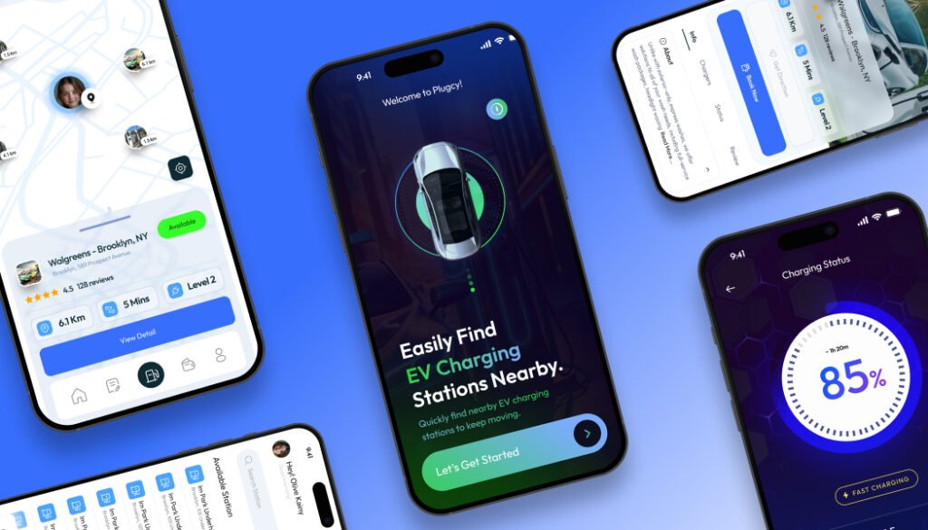
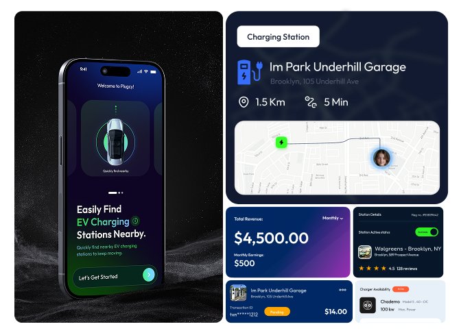
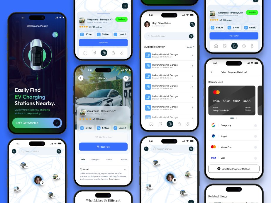
New app opens to a fully loaded map in under three seconds. The brand name Plugcy appears at the top. Below that a tagline says EV charging station nearby. Green pins show available stations. Red pins show busy ones. Tap any pin and you see charger type, speed, and a navigate button.
Real time availability is the biggest fix. Green pin means free right now. Drive there with confidence. The old app showed data from an hour ago. Charger types now have icons. CCS, CHAdeMO, Type two, Tesla Supercharger. You see immediately if your car can use that station.
One tap navigation means no copying addresses. Tap navigate and your phone’s map app opens with directions. Map loads in under three seconds on any phone from the last four years. Old app only worked well on flagship devices.